The Challenge
The traditional B2B model often lacks the human connection needed to help entrepreneurs and startups truly thrive. PM☰LP was built to break that mold by:
🔹 Focusing on real people and real businesses
🔹 Offering a holistic, all-in-one communication package
🔹 Helping startups launch and small businesses scale
🔹 Focusing on real people and real businesses
🔹 Offering a holistic, all-in-one communication package
🔹 Helping startups launch and small businesses scale
The Approach
PM☰LP needed a brand identity that embodied:
✅ Creativity & Infinite Possibility → A brand that adapts and grows with its clients
✅ Clarity & Communication → A no-nonsense approach to branding and storytelling
✅ Human-Centric Thinking → Beyond business, focused on people and connections
✅ Creativity & Infinite Possibility → A brand that adapts and grows with its clients
✅ Clarity & Communication → A no-nonsense approach to branding and storytelling
✅ Human-Centric Thinking → Beyond business, focused on people and connections
The Symbol: The Heaven Trigram (☰)
At the core of PM☰LP’s identity lies its Ξ logo, inspired by the Heaven Trigram (☰) from the I Ching, symbolizing:
🔹 Pure Creativity → The force of creation and new beginnings
🔹 Strong Leadership → Visionary and forward-thinking strategies
🔹 Boundless Potential → No limits to what can be achieved
🔹 Pure Creativity → The force of creation and new beginnings
🔹 Strong Leadership → Visionary and forward-thinking strategies
🔹 Boundless Potential → No limits to what can be achieved
The ☰ emblem visually represents PM☰LP’s mission—helping brands and businesses turn ideas into reality with clarity, confidence, and strategic execution.
Execution & Design
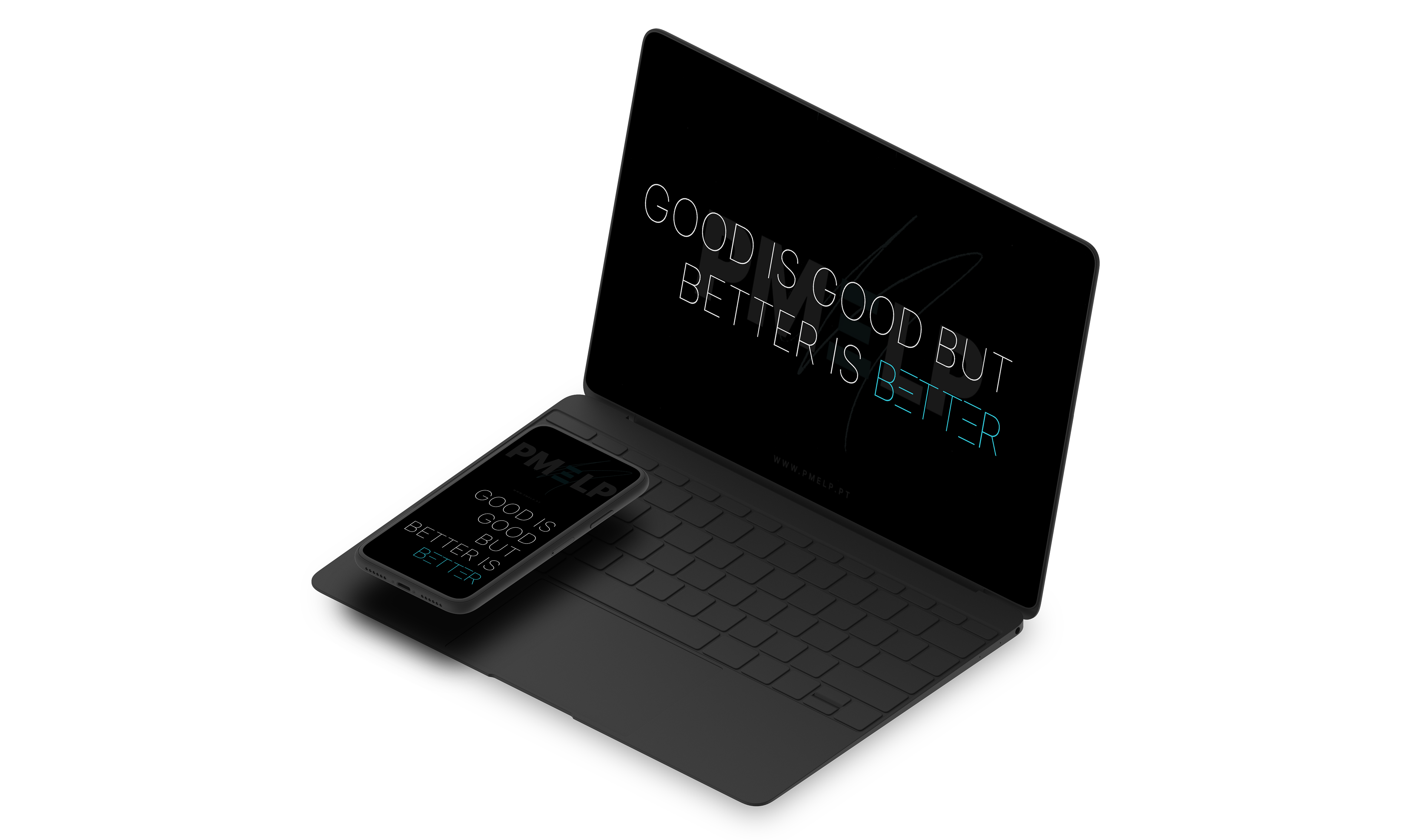
✨ Brand Messaging – "Not a B2B agency. A Human-to-Human agency."
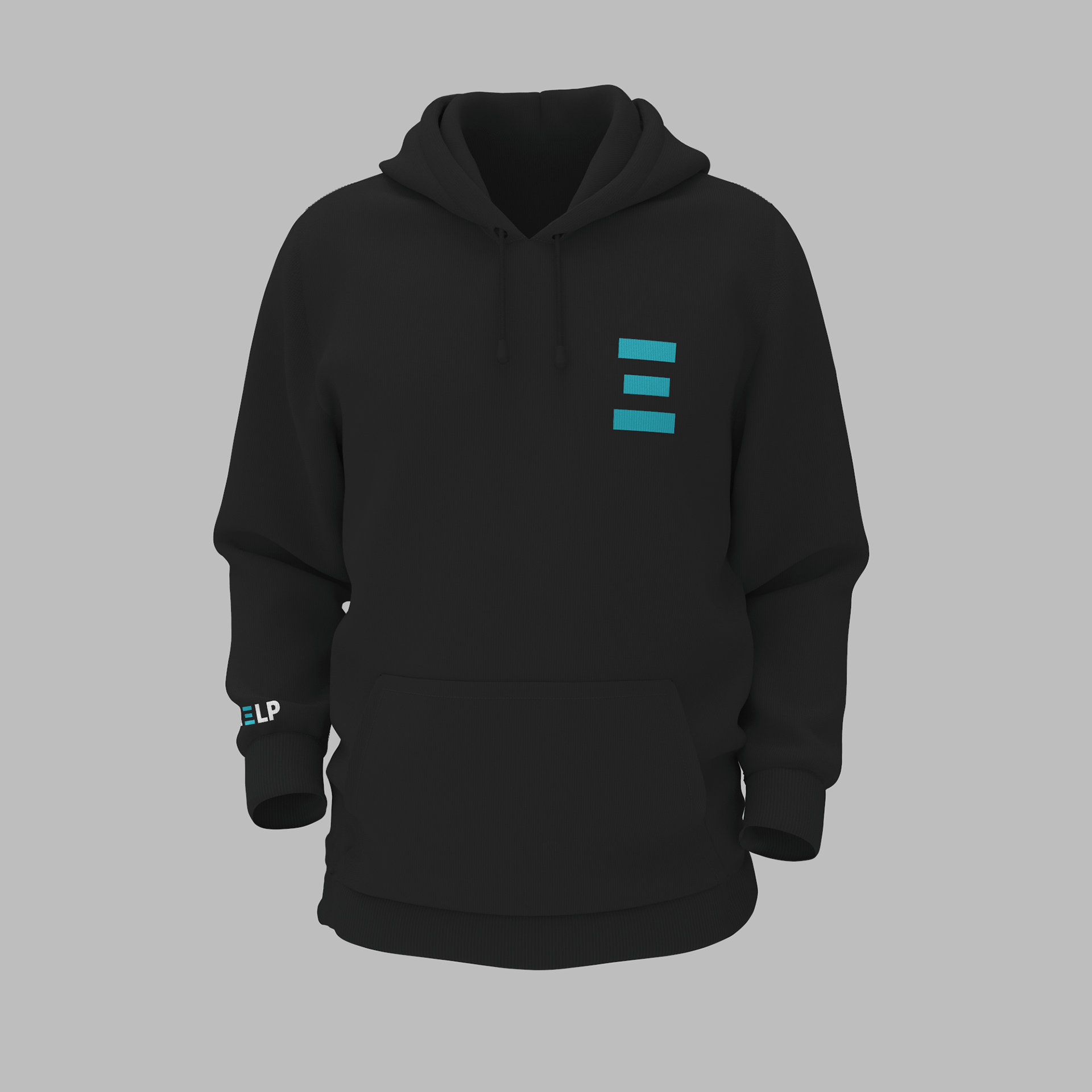
✨ Visual Identity – Minimalist, bold, and forward-thinking
✨ Logo Concept – The Heaven Trigram ☰, a symbol of innovation and creation
✨ Service Model – A 360º approach covering branding, design, digital presence, and marketing
✨ Visual Identity – Minimalist, bold, and forward-thinking
✨ Logo Concept – The Heaven Trigram ☰, a symbol of innovation and creation
✨ Service Model – A 360º approach covering branding, design, digital presence, and marketing
The Impact
🚀 A Brand Built for People – Shifted the focus from business transactions to genuine human connections
🚀 Empowered Small Businesses – Offered an all-in-one branding solution for entrepreneurs
🚀 Inspired Startups – Helped new ventures launch with confidence
🚀 Empowered Small Businesses – Offered an all-in-one branding solution for entrepreneurs
🚀 Inspired Startups – Helped new ventures launch with confidence